Big Data has even reached Las Fallas in Valencia

AI of Things    8 May, 2017
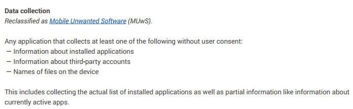
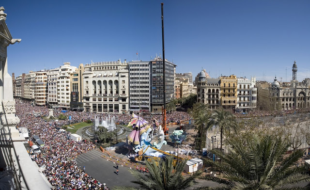
Just a few months ago, the capital of the Valencian community hosted the biggest party of the year: Las Fallas de Valencia. Every year from the 15th until the 19th of March, Valencia celebrates the arrival of spring with an event that is world-renowned.

In the weeks leading up to Las Fallas, the Valencian people working to create over 700 card statues that are linked to prominent characters from their history. The main event of the festivities is the powder that lights up the city on the night of the 19th of March, when all of the memorable parts of their history are lit up by the so-called “Cremà.” The festival has reached such high levels of popularity that in November 2016, UNESCO placed it on their list of intangible cultural heritage.  
Figure 1: Las Fallas de Valencia attract more than one million people each year.
Over the course of the past year, we worked with the Valencian City Council to help them understand and give meaning to the tourism that they receive each year during Las Fallas. We used CARTO (the leading business in interactive maps) to visualize the insights that we discovered through our data analysis. 
Our analysis firstly allowed us to compare the number and demographic profile of the visitors from 2014 and 2015. Not only could we analyze how people moved around the city during the event but we could also capture information to create a comparison between national and international tourism.


Like the two years we analyzed, the 2016 festival was also a definitive success. The festival welcomed over one and a half million people with a spending of 500 million euros.

Mum, I want to be a hacker

ElevenPaths    5 May, 2017
Mum, I want to be a hacker


The hacker concept is most often associated with male ‘techies’ and ‘geeks’. But why is it so difficult to find female role models in the world of technology? We could find the reason in this passionate and lively TED talk given by Christopher Bell, media studies scholar and father of a Star Wars-obsessed daughter, who addresses the alarming lack of female superheroes in the toys and products marketed to children, and how this impacts their view of the world. In the same way, according to various studies, at the age of 11 many girls feel drawn towards technology, science and mathematics, but they lose interest when they turn 15.

In response to this challenge, from Telefónica, throughout the Chief Data Office (CDO) led by Chema Alonso, which includes Aura (Cognitive Intelligence), ElevenPaths (Cybersecurity) and LUCA (Big Data), we thought about this recurring trend and we have decided to “hack” diversity.


We wanted to raise a war cry to change the perception and the course of history. But we knew that we needed examples in order to drive this change. Therefore, today, in the lead up to Mother’s Day, we present the first action which depicts this new culture of doing things. Within our team, we are looking for talented women who are capable of creating technology, women with all kinds of studies, real women of flesh and blood with their own personal stories.

The #hackerwomen from the Telefónica Chief Data Office tell us their stories:

However, we do not want to leave it here. We want you to be part of this. We want to tell the world inspirational stories of women from the technology sector. Testimonies that will help us change the current trend and the course of history.

We will compile the top 20 stories. Please share the video and fill out the following form to tell us how you became a hacker. If you have any suggestions or queries you can write to us at [email protected] or fill the following form.

You can follow us and find out more via our social networks:@Telefónica @ElevenPaths @LUCA-D3

Dan Rosen talked about the importance of adopting mobile advertising: LUCA Talk 4

AI of Things    2 May, 2017
This past Wednesday our head of Global Advertising, Dan Rosen, gave a talk highlighting the importance of a “mobile first, mobile only” approach to advertising. Dan started by giving an overview of his career progression and what brought him to LUCA from an agency background, and what led him to believe in the importance of Big Data for advertisers.

Dan also discussed how the advertising industry has changed massively in the past years and how advertisers really need to fight for attention. He backed this up by stating that we need to move away from the thought process that desktop thinking comes first followed by the mobile user. Today, people will primarily pick up their phone first as it offers a faster, more effective user experience. Dan backed up his talk with strong case study examples like that of Dove using LUCA Sponsored Data in Brazil.
He highlighted three areas to make mobile advertising more effective:
  1. Sponsored Data: Keeping both business and consumer content as the company receives business and this gives the customer free access.
  2. Programmatic Display: This allows for a greater level of business insight.
  3. Messaging: This provides the best consumer interaction and communication.
Keep up to date with the LUCA schedule by staying in touch with our social media and website, we hope to see you at the next webinar!

ElevenPaths and the University of Piraeus in Greece work together using Tacyt as an educational and research unit

ElevenPaths    1 May, 2017
ElevenPaths and the Department of Informatics of the University of Piraeus in Greece work together using Tacyt as an educational and research unit.
ElevenPaths and the Department of Informatics of the University of Piraeus in Greece start a joint collaboration which aims to perform studies and research activities on mobile applications. In addition, providing an educational platform for researchers and students.

The Department of Informatics of the University of Piraeus, Greece, operates since 1991. It is the one of the oldest departments of Computer Science in Greece, and holds a strong position in the Greek and international scientific events. The department specializes in developing secure service-oriented systems, cryptographic solutions, critical infrastructures and privacy. Moreover, the department is very active in R&D projects, having numerous collaborations in the frame of EU-funded projects e.g. FP6/7, H2020, etc. and consulting/developing solutions for large domestic companies and institutions.

This collaboration between ElevenPaths and the University of Piraeus chases targets framed in the joint analysis of applications available for mobile devices from different approaches and angles. This requires a deep and intelligent detection capability, but above all, efficient.

ElevenPaths developed Tacyt. Tacyt is a cyberintelligence tool created to deal with growing concerns in mobile applications. University of Piraeus and specifically the Department of Informatics will start its activities with Tacyt, receiving full support and involvement from ElevenPaths, not only from the technical point of view but also from the academic and educational one. Because of this cooperation at institutional level, both entities will be able to make comprehensive researches including classification, clustering, attribution and detailed analysis of different functional aspects, allowing to deduce and to correlate facts based on different research hypothesis.

The hightlights that Tacyt provides to this type of academic activities are:

  • Capabilities to detect and classify applications under many criterions.
  • Profiling and identification.
  • Intuitive and powerful interface for educational activities.

This agreement presents high expectations and many possibilities we would like to transform into quality scientific outputs, and promotes different educational activities between ElevenPaths and the University of Piraeus.

Innovation and Lab

7 Big Data events in May

AI of Things    28 April, 2017
May is fast approaching and we’re excited to announce a series of events we’ll be taking part in throughout Europe. Take a look and follow us on Twitter to find out more about the content we’ll be sharing.

1. Chief Data Officer Forum (3rd-4th May)

Figure 1: Join the event from the 3rd – 4th of May, London


This event at the Business Design Centre gives those in attendance the opportunity to network with Europe’s leading senior-level data officers and also gives an insight into other various business roles that have stemmed from Big Data. It will bring together some of the most prevelant CDO’s from across the globe with the aim to give a varied programme. Our CDO, Chema Alonso, will be taking part and sharing insights from the world of Big Data and Cybersecurity in the telco world.

2. The AI Summit (9th-10th May)

Figure 2: Another event to keep an eye out for is the AI Summit

The AI Summit is the first and largest exhibition of its kind looking to harness the potential of AI. It will look at the future functions that will exist in businesses through the use of AI and will include over one hundred speakers to gain as much input on the subject area as possible. Sponsors include Amazon Alexa, Google Cloud platform and IBM Watson. Chema Alonso will be discussing the launch of Aura, our new app which will leverage Cognitive Intelligence to redefine our relationship with our customers in Telefónica.

3. TM Forum Live (15th-18th May) 

Figure 3: TM Forum will take place in Nice, France.

The TM Forum will give ease of access to high level players in the world of data. The main aim of the event is to help participants understand the digital world, gauge where they are in the process of working effectively within this environment and then finally optimising their data processes. Florence Broderick, our Global Head of Marketing and Communications, will be discussing the New V’s of Big Data and sharing several cutting-edge mobile data use cases from a range of sectors.

4. Big Data for Social Good in Action (18th May) 

This event is closer to home as we are organizing key players from the private and public sector to explore and understand the potential of Big Data to have a social impact. This event aims to create awareness of the Sustainable Development Goals and how we can use Big Data and other technologies to reach them. Make sure you register your interest in attending here to hear from experts such as Juan Murillo from BBVA Data and Analytics and David Gonzalez from Vizzuality.


5. CIBITEC (18th-19th May)

Figure 5: CIBITEC 2017

This event will bring together universities, businesses and professionals to detail their communication proposals for 2017. Through this proposal they must include details relating to Big Data, Cyber Security and Cloud Computing. Our Global Head of Marketing and Communication Florence Broderick will be discussing key factors when moving forward with the digitalization of the industry. Another event that we hope you guys are as excited about as we are!


6. CIO Congress (23rd May)

Figure 6: CIO Congress in Bilbao, Spain

This congress aims to highlight the challenges CIOs are facing in this digital revolution. This will hopefully lead to a constructive discourse on how CIOs can lead their businesses innovatively and make the most of the IT services they have at their disposal. Our CEO Elena Gil will be discussing her role in taking LUCA forward and maintaining a inventive approach.


7. Strata Data Conference (22nd-25th May)

 
Figure 7: Three day conference taking place in London
 

Strata Data Conference is one of the largest conferences of its kind in the world, with a laser-sharp focus on how data can be used to shape critical decisions across disciplines and industries, from finance and smart cities to retail and government. Both Carme Artigas and Arturo Bayo from Synergic Partners will be present to help for the agenda for efficient big data solutions.

We hope you are now up to date and have been able to schedule in some of these events for the month of May. We at LUCA hope that we can all learn from the variety of content from these upcoming conferences!

Chuck Martin: “The industry can anticipate consumers’ needs even before they feel that need. This is the future that awaits us on Internet of Things”

Beatriz Sanz Baños    27 April, 2017

Internet of Things has become a fixture of our daily lives. Currently, we are equipped with a set of technologies and uses, an ecosystem, that is alive and in full development. Its appearance had been predicted by some experts, like Chuck Martin, best-selling writer, former Vice President at IBM and former director of the MediaPostMedia Research Communications Center. Back in 1998, Martin predicted the arrival of laptops capable of connecting with each other in his book “Net Future”. In other words, this expert foresaw the system that is now the IoT. We have contacted him to find out his particular vision about the present and future that we will see on Internet of Things.

From evolution to revolution

Technology has changed to an incredible extent since the advent of the Internet. What began by connecting equipment and machines in a primitive, practical way has evolved to generate a real network of interconnection between devices and people. What was formerly known as M2M, machine to machine connection, is now the hard core of something more important and much bigger: Internet of Things. “From my point of view, the IoT has two distinct aspects. The first is the M2M or machine to machine-enterprise aspect, which is where businesses are basically using IoT technology to streamline operations and work more efficiently”, explains Chuck Martin when asked about a definition of IoT. “And the second is consumers and the activities that concern them in their day-to-day lives: different ways of communicating, connecting…”. The expert explains that M2M aspect is the technological infrastructure that underlies the system, making the services in the Internet of Things possible.

But how does IoT affect everything we know? “There is a totally different world coming”, says Martin. “If you look at the technological evolution that we have been through, of course the Internet has been a milestone in history. But used to people depend on a computer to be online. Then, the mobile revolution came along, which basically let people disconnect from their computers, making it possible to do anything from anywhere. This changed how people shop, how they access information, how they interact with the device … It changed the real information capabilities and resources available to a person. The new stage is Internet of Things, and this changes everything”. Martin tells us. In his expert words, now everything is connected: people, devices, information … Whereas before it was the consumer who initiated the action by requesting something, now  technology is the initiator, modifying the consumer’s actions, which is a true revolution in the model. “For example, industry can anticipate consumers’ needs even before they feel that need. This is the future that awaits us on Internet of Things”.

The challenges of the future

Just as in any development, Internet of Things is facing a series of difficult challenges that it must overcome. In Chuck Martin’s opinion, the two main barriers to resolve are interoperability and continuity. “First, getting all devices together is extremely difficult. The platforms do not yet work together in the same way, although they will do so in the future. Secondly, another basic issue is that services have to run continuously; they cannot run sometimes and others not. For example, in driverless cars or other connected services where there must be an efficient real-time connection, there cannot be a connection failure”, says the expert. “When you think about the difficulty of connecting billions of devices, you have to keep in mind that this challenge is only going to increase over time”.

But just as there are problems, there are also solutions. For both challenges, the answer is none other than time. “In 1998, I wrote the following in my book Net Future: ‘Wearable computers will venture out of the labs into the workplace, disposable chips will allow appliances to communicate with each other, and more networked devices will continue to be linked to more networked devices.’ And that was eighteen years ago. This gives you an idea of how long it takes to resolve these issues, and that there is still a long way to go before these challenges are overcome”.

The path of digitalization

In the process of evolution, industry plays a fundamental role as one of the main actors, as well as a developer of the ecosystem that allows it to be used by consumers. So are companies adapting to today’s reality which is increasingly immersed in IoT? On what areas are they focusing the most? “Some of the main players on the IoT scene are creating great platforms. Artificial intelligence, virtual reality and augmented reality have been very significant coming down the road”, says Martin. “Big companies are currently looking for the ways to create efficiencies”. But business transformation must adapt to new models that integrate consumer behaviour and needs more efficiently. “In this new arena, instead of companies looking for loyal customers, we are going to see clients seeking loyal companies, and being able to rate them based on this loyalty. This is one of the big changes for which companies have to prepare”.

Chuck Martin is currently working on a new book whose preliminary title is Internet of Everything. The author is seeking the keys to digitalization, which in his words is basically the transformation of all businesses. “After the full deployment of technology, the communication system has to evolve as well, such as advertising, marketing, the way consumers interact with brands… Essentially, I’m looking for the anticipatory market, a scenario in which large companies have to know consumers’ needs before consumers do. This will allow companies to offer the right services or products even before the consumers need them. This change will be fundamental in the businesses of the future and will radically change the way we understand the relationship between the company and the user. And digitalization, and IoT ecosystem that makes this phenomenon possible, play a key role in this scenario.

How much do London firefighters spend on saving helpless kittens? The Open Data answers

AI of Things    26 April, 2017
Original post in Spanish by Paloma Recuerdo

In this second post, a continuation of “Smart Cities: Squeezing Open Data with Power BI”, we will analyse the problem and understand the measures taken by London Firefighters in view of these results as they try to alleviate the situation.

Hypothesis

The time has come to consider what information we want to extract from the data, what answers we are looking for. Some questions may be clear from the beginning of the analysis. Others, however, will emerge as the data reveals more information.

The problem: The alarming signal that led us to consider the analysis is the increase in the number of interventions by the fire department to perform these services, and the associated cost.

Image of campign launch with squirrel
Figure 1: Image of the campaign launched in 2016.

We begin to hypothesize what we will try to show with the data. With the conclusions we obtain, we will look for strategies or define initiatives that allow us to solve the problem or reduce / minimize its effects.

  • Hypothesis 1: The number of services increases each year. If no corrective measure is considered, the cost will continue to increase.
  • Hypothesis 2: The type of animal involved in the incident is essential when discriminating whether or not the intervention of the fire department is really necessary. The location of the incident (rural or urban) may also be related to the type of animal.

The first step is to take a look at the data. Load them as a table, create the names of the fields (some of them will be descriptive, others not), and try some filters. This brief preliminary exploration will help us choose which fields can provide the most relevant information for each report.

* In a more complex analysis, we would be in the phase of selecting which attributes provide us with a greater information gain, allowing us to segment the data more efficiently. For example, what are the attributes that allow us to group and predict the values of the “IncidentNominalCost” field (service cost)?

To work on Hypothesis 1, we will choose the “Line Chart” display. We select the sum field ´CalYear´ (calendar year) and drag it under the “Axis” label to represent this value on the vertical axis (ordered) and the PumpCount field we drag under the label ” Values “to appear on the horizontal axis (abscissa). If we directly select the fields on the list, we can add them in an order that is not the one that interests us, that is why it is better to drag them directly to their final position.

Image of creation of line chart and selection of CalYear
Figure 2: The field CalYear (year) must appear under the label “Axis”, while the field “PumpCount” (number of cases) must appear under the label “Values”.
Thus, we obtain the first graph of the report, which shows the evolution of the number of rescue services per year.
Graph shwowing number of cases a year from 2008 to 2018
Figure 3: Evolution of the number of cases per year.
To obtaina a more efficient analysis of this graph it is necessary to apply some filters. Since the year 2017, we only have some data from the first quarter, so we will cut by full year. We apply the filter:
Example of the advanced filter.
Figure 4: Example of the advanced filter. It only shows the years before 2016

With the new applied filter, the graph would now be the following:
graph showing evolution of the number of cases per year
Figure 5: Evolution of the number of cases per year (filtered).
We can try another data visualization, “Funnel” where it is easier to appreciate the total value of the number of services performed per year. Changing from one to another is as easy as selecting in the display panel the new format with which we want to present the data. Power BI will do the rest of the work.
Horizontal bar graph image fo Funnel example
Figure 6: Display example “Funnel”.
You can clearly see an increase in performances between 2009 and 2011, and how from that point  it begins to decline (we’ll see why), to re-start in 2016. The sample is not very large, we see a trend of the progressive increase in the number of cases.
  
The evolution of the cost of the service per year is not exactly linear since the cost of the service is determined by the number of hours dedicated and may vary in each case. Clearly, in 2011, there has been a change in trend in the evolution of cost, which has been reversed in 2015.
Fill graph showing the evolution of the service cost per year.
Figure 7: Evolution of the service cost per year.
To work on Hypothesis 2, we choose the “Pie Chart” visualization. We select the sum field CalYear and drag it under the label “Axis” to represent this value in the vertical axis (ordinate) and field PumpCount we drag it under the label ” Values “to appear on the horizontal axis (abscissa).
Pie chart showing: Number of services by type of animal.
Figure 8: Number of services by type of animal.
Clearly, most of the incidents have to do with small animals. When passing the pointer for each sector of the diagram we can see the concrete data and the percentage of the total (49.61% cats, 17.91% birds, and 17.79% dogs).
If we translate this into costs, and we return to the “Clustered Column Chart”, we can see the public expenditure dedicated to rescue cats in the period 2009-2016: 866.834 GBP, of which 115.404 GBP was spent in 2016.
Vertical bar chart showing: Cost of the service by type of animal in 2016
Figure 9: Cost of the service by type of animal in 2016.
In this same period 2009-2016 GBP 307,418 has been dedicated to “rescue” birds, 11,084 GBP to rescue squirrels. Between 2009-2010 alone the fire department has had to rescue specimens of these small rodents in distress 34 times.
Analysing the distribution of notices according to the parameter “Animal Group Parent” has revealed information of great interest to us. We are going to finish this analysis by using information about its geographical distribution.
To analyse the geographical distribution, we chose the “Map” visualization. We selected the Borough field and dragged it under the “Location” label, the AnimalGroupParent field under the “Legend” label and the PumpCount field we dragged it under the “Size” label.
We see the distribution of notices regarding cats and dogs is fairly homogeneous in the most urban areas:
Map graph showing the geographic distribution of notices regarding the rescue of cats
Figure 10: Geographic distribution of notices regarding the rescue of cats (in yellow) and dogs (in orange).
Relative to other types of larger animals such as cows, bulls, deer, etc, it is more dispersed and associated with rural areas, as expected. In these cases, when dealing with large animals, it is most likely that the firefighters’ participation is essential to resolving the situation.
Map graph showing the Geographical distribution of warnings regarding the rescue of large animals
Figure 11: Geographical distribution of warnings regarding the rescue of large animals such as bulls (in red), cows (in gray) and deer (in blue).
Therefore, as mentioned previously, the parameter “AnimalGroupParent” is emerging as one of the parameters that provides more information when discriminating or at least prioritizing services.
  
If some points appear “out of field”, it can be due to duplications or errors in the names of postal codes or names of cities that coincide on either side of the Atlantic. In those cases, we can click directly on those points and exclude them from the graph.
map showing anonomous data
Figure 12: Example of clearly erroneous data due to duplications of names, numerical codes etc.
PowerBI also allows us to view segmentations. We can segment the report data by a specific value, for example, by year or by geographic location. As an example, we will segment the number of services performed in 2016 related to “small” animals (dogs, cats, birds, hedgehogs, hamsters, squirrels, ducks, etc.).
To perform this segmentation, we chose the “Slicer” visualization. Select the Borough field (District) and, automatically, all the other panels of the visualisations will show the information corresponding to that specific segment, which, in this case, corresponds to a district.
Graph showing Appearance of the visualisations with two different visualizations
Figure 13: Appearance of the visualisations with two different visualizations (table and funnel) after applying the segmentationBorugh = “City of London”


We could still go deeper with PowerBI and perform an analysis of the text included in the “FinalDescription” field. For example, to group and analyse in greater detail those in which the previous intervention of the RSPCA have mentioned (“… ASSIST RSPCA …”), or occurrences such as “Trapped” or “Stuck”. This type of “Text Analytics” can also be carried out with PowerBI thanks to its native integration with R.
Conclusions: Measures need to be taken
All the previous analysis has served to confirm the hypothesis 1 that could be reformulated as:
 “If no measures are taken, the inadequate consumption of public resources in this type of service will continue to increase year by year”
If we add the following data to this:
  • The citizens of London feel a great love for animals (it may seem a cliché, but the data we have analysed corroborates this)
  • The good citizen who calls the firefighters to help an animal does not pay out of their pocket for the cost of the service …. Or if they even pay for it?
It seems obvious to draw the conclusion that the citizen who makes the call is NOT aware of the cost incurred in carrying it out. They do not realize the waste of public money (and the misuse of an emergency resource) that is involved when calling the firefighters to rescue a hamster, or a dove trapped in a line or help a cat down from a roof.
  
This poses a problem for the one who haa to give a solution that should result in a more efficient use of public resources and a better service to the citizens. In this case, a public awareness campaign was proposed.
2012: The Campaign
In July 2012, the London Fire Department launched the campaign:
Poster of london Firefighters Campaign 2012
Figure 14: London Firefighters Campaign 2012: “I am an animal, get me out of here”.
The objective of the campaign was to educate the citizens on how to continue being “good Samaritans” in the case of finding animals in delicate situations without, therefore, misusing public resources.
The campaign had two axes:
  • On the one hand, to inform people about the general cost to the citizens of giving this type of warning directly to the fire brigade
  • And on the other hand, to show what would be the most appropriate alternative route in this type of situation. In this case, call the RSPCA (Royal Society for the Revention of Cruelty to Animals).
This campaign had an immediate positive effect on the population that is reflected in the decrease in the number of calls registered as of 2012.
News article on the decline of animal rescue services.
Figure 15: News about the decline of animal rescue services.
However, in 2015 there was a new trend change with a rapid increase in the number of cases. The firefighters used social networks to spread the campaign.
Poster encouraging citizens to call the RSPCA
Figure 15: News about the decline of animal rescue services.
New article on the BBC about the campaign
Figure 17: BBC campaign
And, in February of 2017, an interactive map was published:

Interactive Map
Figure 18: Interactive Map
It is clear that these types of campaigns must be repeated periodically in order to maintain effectiveness.

Final conclusion

The greater availability of open data on public services, along with the different tools that allow them to be combined, help us to analyse patterns and create visual models that can quickly translate into cost savings, and leave citizens satisfied and involved with their environment.

This has been a very simple example, but with palpable results. If in 2016 we discounted the outputs of the Fire Department relating to mishaps of domestic or small animals, which we considered “avoidable”, the savings would have been £ 215,160.

If we take into account the potential of applying Data Science to the entire arsenal of data collected and stored by institutions and companies today, we realize the great opportunity we have to improve our environment and our lives. Let’s take it!

Smart Cities: Pushing Open Data with Power BI

AI of Things    24 April, 2017
In this article, which will consist of two posts, we will talk about Smart Cities and how they can use their data to be more “smart.” We will work with an example dataset from the London Data Store (about Fire Services) to learn how to use Power BI Desktop as a data analysis and visualization tool. The article will finish by drawing various conclusions from the studied data.

 
I. Background: Smart Cities and Open Data
 
Cities offer different services to citizens and therefore need to collect and store a large amount of diverse data. Other bodies and public administrations that are financed by citizens generate information such as geolocalised information, weather conditions and medical information. Supporters of Open Data argue that the information should be accessible and reusable for the general public, without requiring specific permissions. They deem restricting their access as going against the common good, since the information belongs to society as it has been financed by society members themselves.
 
Almost a decade ago, in 2010, the first Open Data Day was celebrated, which brought together 60 cities interested in being able to use this information to offer better services to the citizens and to help them solve the different challenges that were facing them.
 
Figure 1: What opportunities can Smart Cities offer?


What are these challenges? 


Although each city has its peculiarities, many of them are shared between different cities of the world. We are talking about challenges such as the continuous increase in population which stems from people moving from rural areas to cities. We are then also faced by problems such as traffic congestion, pollution, rising housing prices, aging infrastructure and services on the verge of collapse.
 

How does a Smart City address these challenges?

 
When we talk about Smart Cities, we basically talk about infrastructure, connectivity, IoT and of course Open Data. We are talking about Big Data technologies, machine learning and extraction, transformation, normalization, processing and data exposition. All of these prior actions will allow us to take advantage of all that information, detect problems, extract patterns, analyze behaviours, hypothesize or optimize models. In short, use the available data to optimize the services offered to citizens.
 

An example:

 
When Open Data is macro-managed at a local level, it allows for very focused initiatives to help aid the real problems of citizens. For example, in many large cities, the shortage of parking places is a real problem, while at the regional level, the number of places may seem sufficient. Cities that provide real-time information on the availability of these places promote the development of apps that direct drivers to them, reducing lost travel times and pollution rates. Another interesting example is apps based on the data that local government offers on contamination and levels of allergens so that the affected people can take measures that minimize their effects.


Figure 2: Examples of applications like Google Play that measure the levels of pollen.
 
You can also combine data from different sources, data from public administrations with others offered by private companies (treated to remove confidential customer information from them). LUCA collaborates in Big Data for Social Good initiatives, providing great value by offering NGOs and governments anonymized data on the location of mobile terminals that have proven to be of great interest in generating insight into natural disasters. These insights allow them to send the needed emergency help and resources faster and more efficiently.
 
For this reason, many cities, not just big capitals, want to become Smart Cities. A connected city can use information and technology to offer its citizens a policy of transparency (based on open data), more efficient services (optimizing the use of public resources and reducing costs) and effective empowerment and a greater participation of the people in the decision making that affect their day to day). There is always a “but” that must be considered…
 
As always with innovative projects, there have been no shortage of alarm bells ringing and criticisms about the risks of the Smart Cities. Some authors believe that it is a model driven by large engineering, technology and consulting firms solely for the benefit of their own interests and that they are predicted to be the cause of the “end of democracy” as highlighted in the article, “The Truth about smart cities: in the end, they will destroy democracy’.
 
It’s safe to say that sometimes technology is put ahead of people. When you start to only think in terms of sensors and algorithms, confusing the means with the ends, you do not take into account what the needs or problems of the real people. In these cases, the result can never be positive. “Making Cities Smarter: How Citizens’ Collective Intelligence Can Guide Better Decision Making” suggests we should take into consideration collective citizen intelligence to help IT decision-making to build a real, human build smart city” which can take the bottom-up approach being led by the citizens.


II. The Problem

 
Figure 3: Image of London Data Store.

London was one of the first European cities to opt for an Open Data Initiative, and in January 2010 they launched the London Data Store, where data sets were published covering a wide range of topics including: economy, employment, transport, the environment, security, housing and health. This Data Store contains more than 500 datasets and its website is visited every month by 50,000 people. In 2015 they received the ODI Open Data Publisher Award for pioneering work in publishing open data at both local and regional level.

 
This initiative gives us an excellent example of Open Data that has been maintained locally. This has proven very useful for undertaking initiatives that concen it’s citizens, providing solutions to specific problems and translating this into innovative use of technology for the benefit of the inhabitants of the city.
 
The next section of this post we will work one of the more “picturesque” data sets offered by the London Data Store. This will include data collected about the animal rescue services provided by the City Fire Brigade. The analysis of this data set will present a new problem with which we will try propose solutions.
 

What challenge faced the London firemen?

London Fire Brigade rescues pregnant cat
Figure 3: Firemen in Tottenham who rescued a pregnant cat.


The data

We will now take you step by step through how to analyze the London Data Store information. Firstly please download the following excel document.
 
 
This is a table of 4751 records, which collects information on the departures of firefighters to cover this type of service. The main fields are the incident number, the date and time of the alert, the hours dedicated to the problem, the cost of the service, the type of animal involved, a brief description of the problem, origin of the alert and the type of location. 
 
Although it is not relevant for our analysis, whenever a file or document is downloaded from the web, in this case an Excel table, it is advisable to check its level of security regarding metadata exposure. There can be data hidden amongst data that can provide sensitive information about our working environment without us being aware of it. We use the Metashield Analyzer tool to ensure security. In this case, we will simply analyze the file (Step 1). When we ourselves are the ones publishing information in a datastore we will make sure that we do not post information that could cause us to be hidden in the metadata using Metashield Protector (Step 2).


The result of the analysis shows a low level of risk. The “exposed” information is inadvertently related to the printer and creator of the document. However, it is always advisable to check.


We will work with a tool that allows us to perform visual analysis very intuitively and create reports that will highlight the patterns that characterize the data. This is the Power BI Desktop tool.

                                        
Power BI is a collection of software services, applications and connectors that work together to turn unrelated data sources into coherent, interactive and visually appealing information. A typical Power BI workflow begins with Power BI Desktop, where a report is created. This report is then published to the Power BI service and then shared so that users of Power BI Mobile applications can use the information.”
 
Power BI allows the user to create visual reports using different data sources from a simple Excel table to a collection of local or cloud-based hybrid data stores. They can be shared, updated in real time, our example does not require such complications. We have a simple Excel table, we will load it through the desktop tool and we will get various reports that we can use internally. We can work without any problems with the free version of the tool, for which we only have to register to use.
 
We downloaded the application and installed it just like any other Windows application.


Figure 7: The initial installation screen for Power BI Desktop, simply choose the correct format for your desktop.


Format the Data

 
In this example, we will work with an Excel file. If we worked with Excel files in OneDrive, reports and dashboards in Power BI would automatically update when you make changes and save the job. 
 
For Power BI to be able to import the data from the workbook, the data must be in a table format. It is that simple. In Excel, you can highlight a range of cells and, on the Insert tab of the Excel ribbon, click Table. It’s also important to make sure that all columns have a proper name so that you can easily find the data that interests us when creating reports in Power BI.
 
Although many of these aspects can be modified again once the file is loaded, it is usually more convenient and faster to do this debugging the data before loading.
 
We created a new report and chose the first available data source: Excel. Get Data>Files>Local File, to find and select the Excel file you want.


Figure 8: Screenshot for the selection of the data source. Show all possibilities “data source”.
 
A new window the appears that allows us to choose which sheet from the data table which we are most interested in. it shows a preview of the table and gives us the possibility as we indicated before to edit it. In this case we load it directly by selecting the “Load“button.
 
Figure 9: Selection screen. It allows us to select which pages from the Excel we wish to load. It then offers a partial visualization followed by the ability to edit the data.


As these things never go well at first, we get a nice error message. We have no less that 2853 errors. We can investigate there origin directly from the “
View Errors” section.

 
Figure 10: Error message that appeared when we loaded our example.
 
It seems like the problem stems from the format of the “End of Service” field. It has given the same value to all fields.
 
Figure 11: Yellow highlights the fields that were not able to load correctly.


As this data does not give us any relevant information (due to the services only lasting hours instead of days and as we already have the start date for the service these then becomes redundant. For this reason we can simply delete this column. Highlight the entire column and in the menu select “Remove“.


Figure 12: Deleting one of the columns
 
Another option would be to delete the column and only use the data from the year:


Figure 13: Instead of deleting the data we can change the form of viewing it and use the data for the year.


The format of the “DateTimeofCall” field also doesn’t seem sufficient. This time we opt for the “Change Type” option from the same menu however we convert it to include a decimal point.


Despire reducing the number of errors through reloading the data there continues to be errors in some of the fields. Now we are dealing with the “IncidentNumber” field, the format that should be applied is the “Text” format. “Close and Apply“.


Figure 15: Change the format from Incident Number to the text format


Visualizing the data with Power BI, basic concepts.

 
Once we have loaded the data we can begin to generate reports. We will first look at some of the basic concepts of the tool and we will then move on to the panel of reports for this case. 
 
In light of this report there a five clear areas:
 
1. Range of tasks, this shows the common tasks associated with the reports and visualization.
2. The Report view or canvas, where visualizations are created and organized.
3. The Tab area which is located in the Report section, this allows us to select and add a page to the report.
4. The Visualization panel, this is where the visualization can be editted, personalizing colours, axes, applying filters or drag fields.
5.  The Field panel, filters can be pasted to the report as well as the Visualization panel. Through loading the data, we can see the distinct fields in which the reports can be developed.
 
To create a visualization, simply drag a field from the list of fields to the report. The result will be the default data table. 
 
We can also firstly select the type of visualization that we want and then drag data fields to bookmark the position on the canvas. 
 
 
Figure 16: By choosing a visualization,  a canvas appears in the corresponding bookmark.

The end result of the visualization depends on how we are formatting the data. The type of visualization also affects how the changes can automatically become updated through the process.

 
Figure 17: Making a selection from the list of fields that we want to add and then drag them to the canvas of under the corresponding label under the window “Visualizations” (Axis, Legend etc.).


Finally, we can change the size of the display on the canvas, reposition it, edit it, add labels and modify colours etc. As we hover over sections of the visualization we can see information about tools that contain detauls about that segment, such as tags and their total value.

 
Figure 18: We can modify the visualization directly from the canvas (with the menu of its own window) or using the different tools that appear in the menus to the right of the screen, as we hover over it.

Returning to our first example, we dediced to create a table visualization of the data. The bookmark is created and from this point we select the fields of data that we are interested in (highlighted in yellow), these are then added to the table. 

 
Figure 19:

The selected fields (highlighted in yellow) appear under the “Values” column. Using this method you can add the selected fields directly from the list. In other visualizations, it is advisable to drag the field under the column with the correct label that we want (Legend, Shared Axis, Column values, values etc). 

At the same time, filters are added for data field:
 
Figure 20: In our example, through added the “AnimalGroupParent” field automatically allows us to filter for each type of animal that appears in the group.


We now have access to a tool to work with the dataset from the special services of the London firemen. We have the magnifying glass to analyse the clues. The question is, what conclusions will we reach? Look out for our next post which will hopefully give you an answer.


Squeezing the numbers and facts of Google’s annual Android security report

ElevenPaths    24 April, 2017
Last month Google published its third annual security report on Android’s security protections, aiming to send a clear message to the world about mobile malware (or Potentially Harmful Applications (PHAs), as they like to call them): devices, apps, and Android users are safer than ever. And the entire Android ecosystem is now more secure.
Sending positive messages is ok, but is good to be realistic as well. That is what makes us all improve. We have squeezed some numbers and facts included on the report, to finally determine that it’s hard to believe that actually the Android ecosystem is as secure as Google claimed, as the used terminology is not clear and some showed numbers are not aligned.
It is all about “malware” definitions
According to the report, PHA are “applications that could put users, user data, or devices at risk”. This include among many others trojans, spyware, or phishing apps. That is ok, but, as Google recognized, “we are also less strict in our definition of certain PHAs than some users expect. A classic example is advertising spam, which we define as an app that pushes advertising to the user in an unexpected way, such as on the device home screen or lock screen”. This means Google does not count aggressive adware as PHA, which is the most common problem for Google Play users. There is no evidence of aggressive adware definition included in The Google Android Security Team’s Classifications for Potentially Harmful Applications. How this “advertising spam” or aggressive adware may it be? We do not know. Some “so called” advertising campaigns ended up rooting the device. This definitely makes the numbers go down and it is maybe one of the gaps antivirus companies and Google play with.

Another interesting point about PHA definition is that Google has removed a subset of the malware that could be considered as “spyware” from this taxonomy. Since 2016, Google introduced the concept of Mobile Unwanted Software (MUwS):An example of common MUwS behavior is overly aggressive collecting of device identifiers or other metadata. Previously, we categorized some of these apps as PHAs, but to improve the clarity of our classifications we’re now classifying them as MUwS”. “We defined MUwS as apps that collect at least one of the following without user consent: Information about installed applications; Information about third-party accounts; Names of files on the device”.
Spyware is still present as a category itself, but just if it collects “sensitive” information. Now we have to deal with two Google’s taxonomies for classifying apps: PHA and MUwS, which are potentially harmful and unwanted software. The question is then, how many devices have PHA and MUwS installed?
Actually this is the infection rate with PHA and MUwS included. Interesting to note that Google did not count infected devices as devices where the user himself has decided to root the telephone (something very common in some countries). At some point in 2016, they seem to have changed the way they count unique devices. Just before the infected rate was getting higher. We do not know how this used methodology affected the reported numbers.
Moreover, Google dedicated some space in the report to talk about the Turkish Clicker, a relevant peace of malware we have followed since 2015, and confirmed by the Check Point research team. Although the Turkish Clicker malware family has been present on Google Play for a long time, and with active campaigns several times since 2014, it is not considered PHA by Google: “By itself, this click fraud behavior is not a PHA: clicking on HTTP links does not violate any of Android’s security boundaries or put user data at risk. This family has been classified as hostile downloaders because, in some cases, the ads unintentionally downloaded other PHAs to the user’s device”. Does this mean then that Turkish Clicker downloads and installations on Google Play are not included on this “PHA statistics”? This is confusing. When they specifically talk about this sample, they do not even draw which numbers of installs apply on the y-axis in this graph.
  • Google stated that Android constitutes now more than 1.4 billion devices. The main headlines are that by the end of 2016, less than 0.71% of devices have a PHA installed. Therefore, it means they are infected. This goes down to 0.05% for devices that exclusively download apps from Google Play. That message could mean that malware is not a real problem for users… but, really? Some vendors stated that infection rates are just double, over 1.4%;
  • A very good antimalware built-in tool for Android is Verify Apps. This proto-antivirus scanner is checking apps every 6 days now, at least. Verify Apps automatically blocks install attempts initiated by an installed PHA since September 2016.
  • In 2016, only 0.02% of installs downloaded from Google Play were discovered to be false negatives. This means, “not detected by Google itself with their antimalware systems”. For installs outside of Google Play, the numbers are higher; the average false negative rate is 2.6% within the first 90 days. 0.02% is not a bad false negative rate, but we should take into account they have the right to disallow apps to get into Google Play;
  • It seems that, with some kind of malware, the overall health of Google Play has increased year over year. However, in the same report they claimed SMS fraud apps had increased 282% and toll fraud 592% during 2016. It means 5 and 2 times more SMS fraud and toll fraud apps in the official store. Toll frauds are whatever other way (other than premium SMS or calls) that attackers may charge the user (WAP traffic, etc).
HummingBad: numbers do not add up
HummingBad and all its family around is a special case. HummingBad stands out as an extremely sophisticated and well-developed malware, and there is no doubt it was one of the biggest problems for Android users during 2016. It was first been discovered by Check Point on customer’s devices in February 2016, and it is a very aggressive malware that gets into Google Play from time to time and infect millions of devices (10 million victims, rooting thousands of devices each day and generating at least $300,000 per month). Check Point has detected and tracked it for a long time, so they have special and “first hand” statistics and reports for HummingBad. Check Point even got into the Command and Control and they know well how aggressive this campaign was. In this graph below, you could see how the HummingBad instances (unique devices infected) get high during May 2016 and then goes down to eventually die.
The lower figure shows an image of the control panel of Umeng (ad-company) obtained by Check Point, which revealed that users (and benefits) grow from 2015 to May 2016 as well.
Google’s annual Android security report reflected HummimgBad installs on a different way. As showed below, they claimed HummingBad peaked between February and May of 2016, and then the installs went down very quickly, even quicker than Cheetah Mobile or Check Point seems to reflect (no y-axis explanation included on Goggle’s graph, so we do not know how much or how quickly). The HummingBad report from Check Point went out in July. Maybe this helped “cleaning” devices, but that is not clear. Maybe Google is not counting HummingBad straight consequences (more malware/PHA/HummingBad installs) as infections.
Moreover, Google claimed: “Of the 24,000 HummingBad apps with about 379 million installation attempts (25.1% of which were blocked or warned by VerifyApps), only one app was uploaded to Google Play and was suspended before it reached 50 downloads”. This is true as HummingBad did not get into Google Play the first time. However, it did the second time it returned publicly, at least in December 2016, when found by Check Point as a new variant of the HummingBad malware, dubbed “HummingWhale”, hidden in more than 20 apps on Google Play. This December come-back is not reflected in the charts…. Unsuspecting users downloaded the infected apps in this campaign several million times, but, according to the graph, infections in December inside Google Play are not even reflected (graph stops in November).
But, aside of this confusing data, Google showed the table below, where they stated they had blocked 99,96% of “install attempts”. This data spans April 2016 to December 2016. Therefore, it means the data showed by the report does not include from January to March, when the infection rate was higher.

Figure: What are the conclusions exactly we should extract from these graphs? What is the percentage of PHA, MUwS or PHA+MUwS really installed?
Conclusions
As explained, it is hard to believe that actually the Android ecosystem is as secure as Google claimed, as the terminology used on the report is not clear and some showed numbers are not aligned. Google has improved Android security, it is not easy to break. However, do not forget that most of malware on Android does not mainly need, so far, to bypass security systems to take over the system or brake it. The user (weakest link of the security chain) is the one installing the malware and giving it the high permissions.
This 2016 report stated “a user was ten times more likely to download a PHA from outside of Google Play in 2016”. That means that Google Play is safer than alternative markets, but there is still a lot of work to do in order to protect actively users from application threats.
For example, playing with the ”malware” terminology, the graphs or “ignoring” aggressive adware or clickers as a PHA impact on report reliability. Specially when related with adware and privacy problems: Airpush, one of the well-known aggressive adware SDKs, is still quite frequent in the market, as we have seen with Tacyt screenshot below.
Aside, for malware present in Google Play and infected systems, numbers about HummingBad, HummingWhale are maybe not as good as shown in the Google’s report. As we said above, sending positive messages is ok, but is good to be realistic as well. That is what makes us all improve.

LUCA Talk 4: Disrupting Mobile Advertising with data-driven solutions

AI of Things    20 April, 2017
Smartphones have became an integral part of our lives, for most of us we can’t sleep or even wake up without checking them. This has given the importance of mobile marketing and advertising a bigger and more relevant presence in today’s market. IDC research shows that a staggering 79% of smartphone users have their phone on or near them each hour of the waking day.

Importance of Mobile Marketing
Figure 1: Dan Rosen will be discussing the importance of mobile marketing.


The fourth LUCA talk will be given by our Global Head of Advertising, Dan Rosen. Dan will take us from a desktop centric approach to realizing the importance of a mobile led approach to advertising.
He will discuss Telefónica’s place in this new advertising ecosystem and will include information surrounding other Telco´s leading the way.

The webinar will consist of a 25 minute presentation followed by 20 minutes for questions you might have. If you are interested on attending, do not forget to register here.